
Challenge: Evolve the brand’s positioning and visual identity to modernize and better reflect the company’s position as a leader in workplace tech. As the company shifts from a transactional marketplace focused on individual orderers, to a food platform for workplaces, the brand needs to reflect that tech-forward ethos. As well, Relish, the subbrand for providing individual employee meals, needs to be incorporated into the ezCater brand to grow awareness of the full capabilities of the platform.
Solution: The new positioning brings all offerings under the ezCater brand, introducing a new 'branded house' architecture, with intuitive product names, and a modern, tech-forward identity.
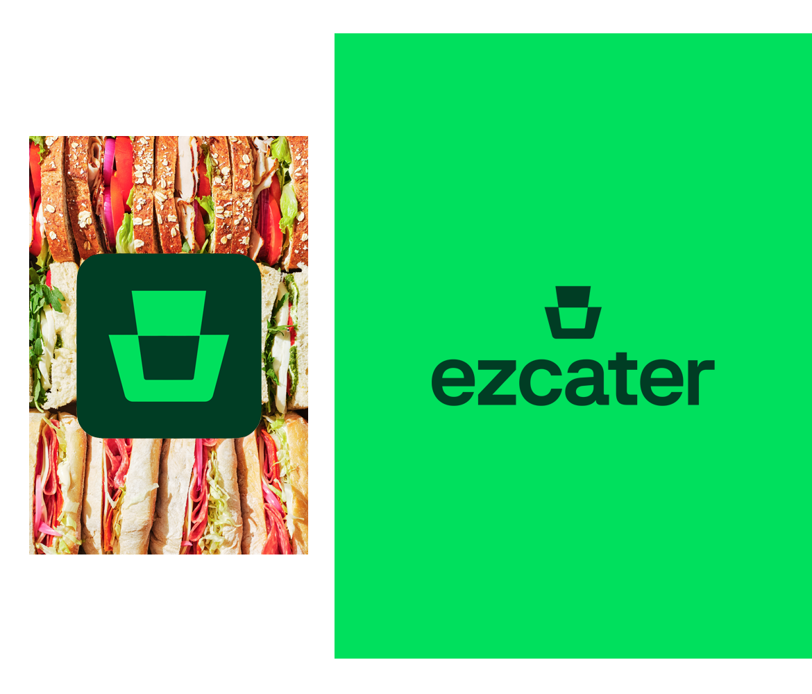
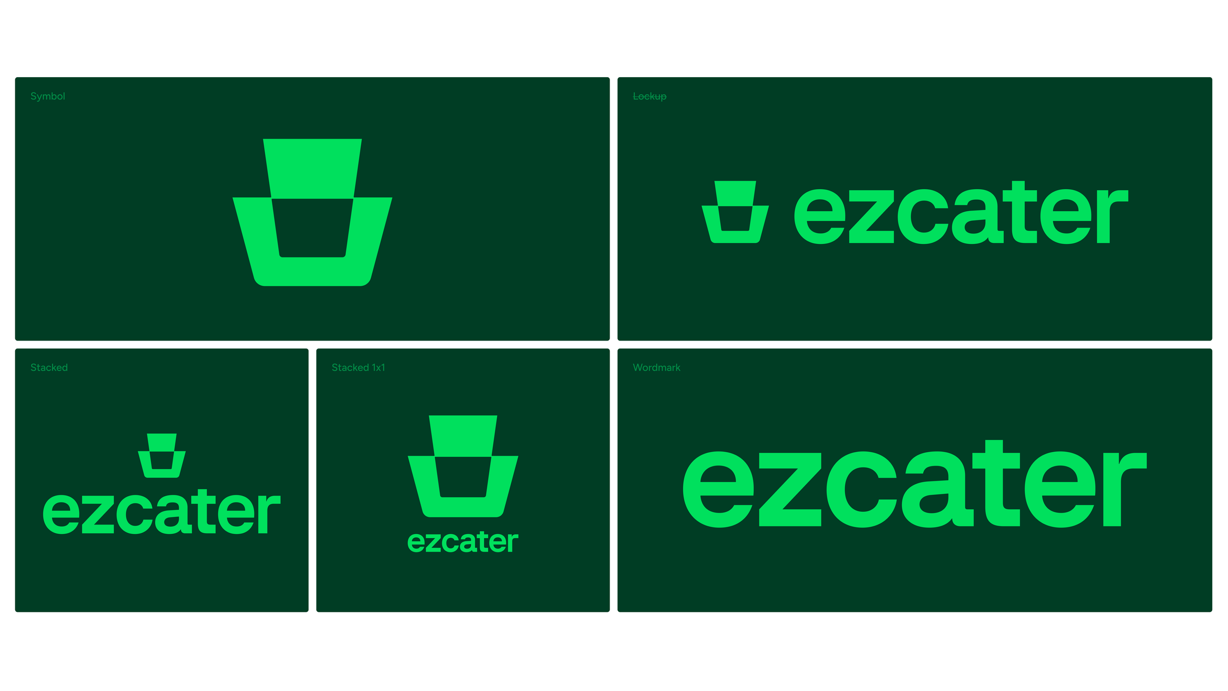
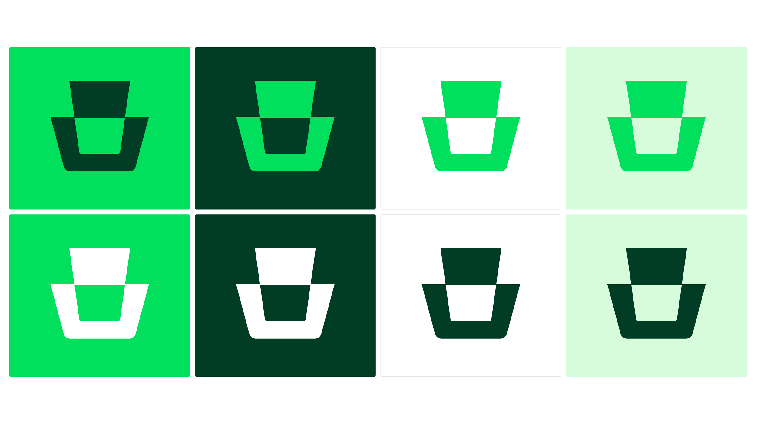
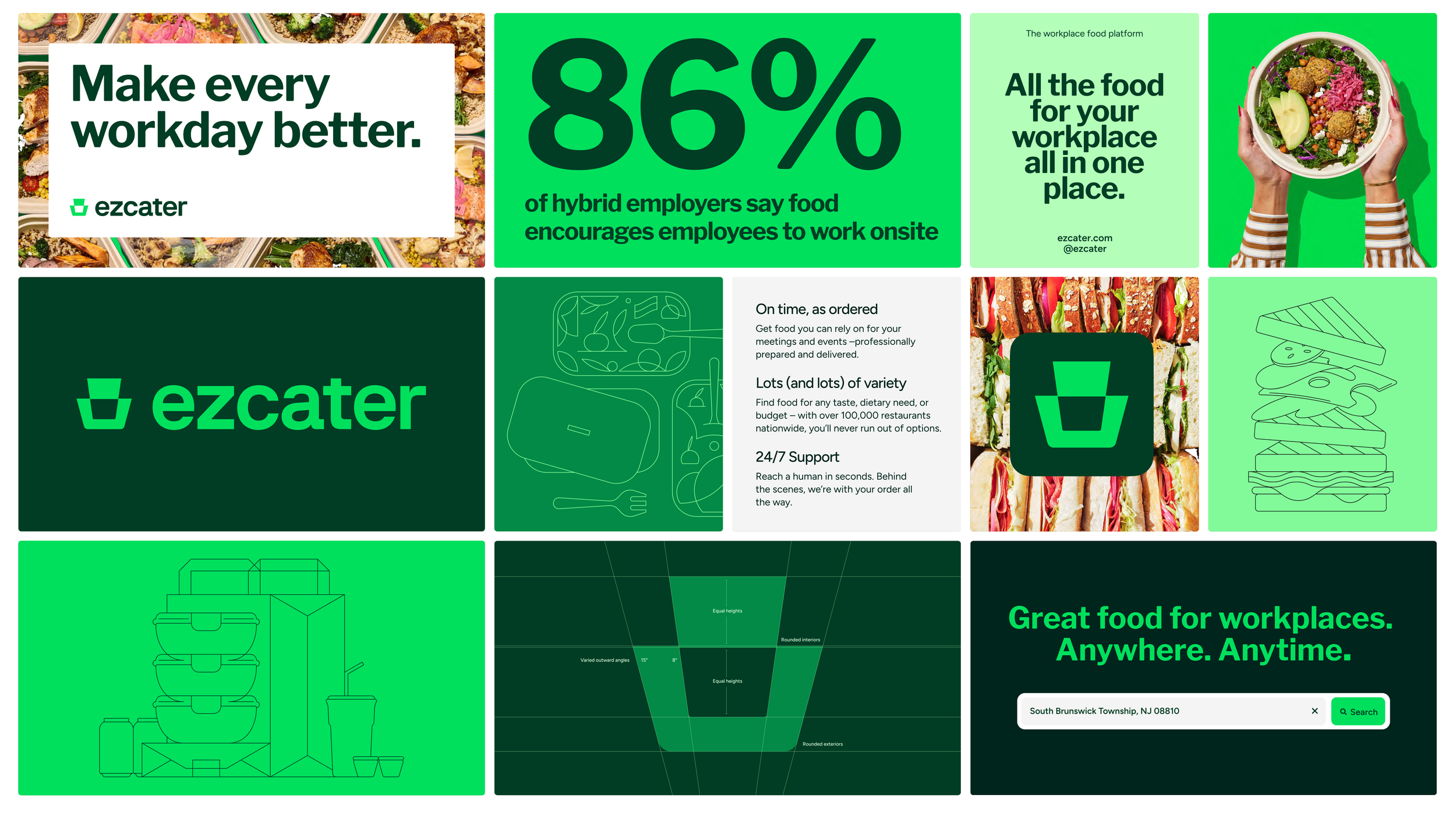
The logo reimagines the keystone as a modern, tech-driven symbol of reliability and connection, reflecting how ezCater holds every part of workplace food together. Its clean, structured form mirrors the brand’s promise to make food at work predictable, efficient, and effortless to scale.
The mark uses positive/negative space to suggest motion and seamless integration, symbolizing how ezCater 'clicks into place' with other workplace platforms.
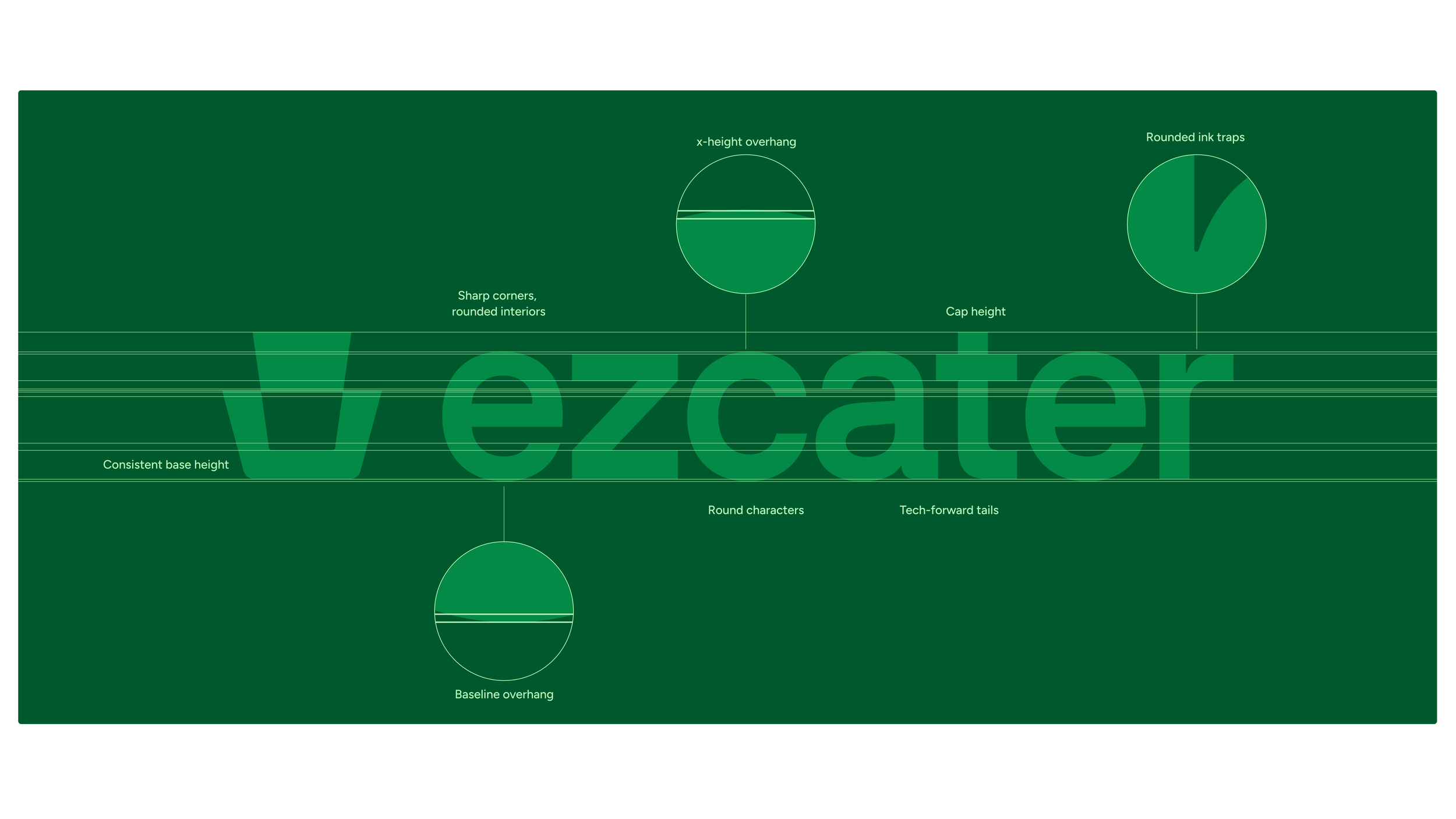
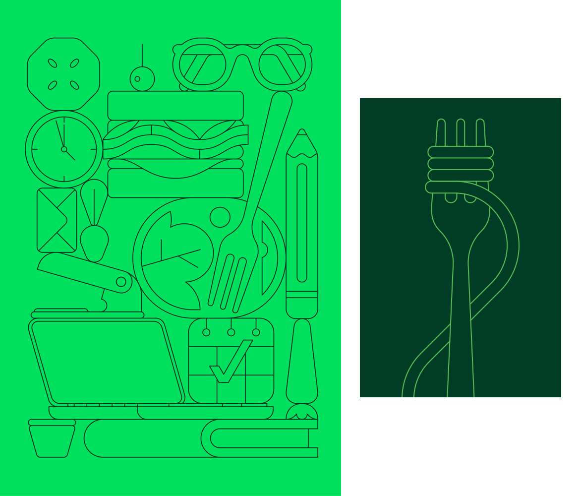
The clean, structured mark, paired with tech-forward typography, an accessible, scalable color palette, and simple, geometric illustrations, establishes ezCater as the workplace food platform.
Agency: Koto
Illustrator: Calvin Sprague